

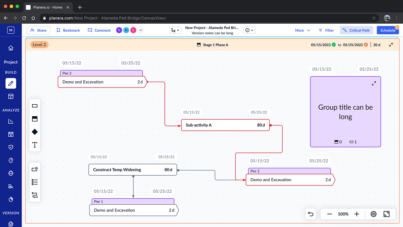
Understanding the System
Construction Planning Is A Coordination Problem
Schedulers create long-term plans, manage critical paths, assess risk, and optimise resources. Superintendents execute those plans in the field through lookahead schedules, commitments, and day-to-day coordination.
The master schedule acts as the shared source of truth connecting both layers. As Planera expanded beyond a small group of scheduling experts, maintaining visibility and orientation across increasingly complex project structures became more difficult. The platform needed to scale — not just technically, but as a coordination system.
Planning Layer
Schedulers
CPM · Critical path · Resource allocation · Risk analysis
Shared Source of Truth
The coordination layer
connecting planning and execution across the project lifecycle
Execution Layer
Superintendents · Foremen
Lookahead schedules · Commitments · Day-to-day coordination
The Challenge
Deep Navigation Wasn't Scaling
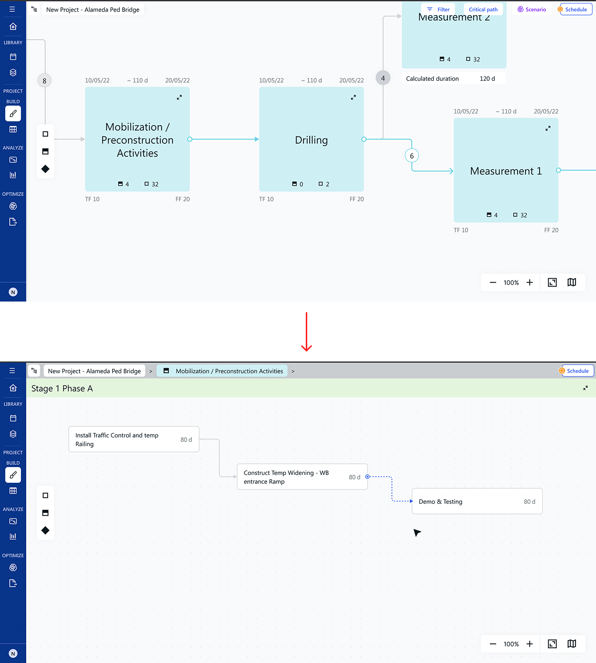
As projects grew, users had to navigate increasingly deep hierarchies spanning groups, activities, and project structures. Navigation and orientation repeatedly emerged as friction points for both users and stakeholders.
The challenge wasn't simply helping users move through the product. It was helping them understand where they were, what surrounded them, and how different parts of the project related to one another — a coordination problem wearing the clothes of a UI problem.
Constraints
What the solution had to be true of simultaneously
-
01
Deep hierarchy support
Groups can nest without limit. Navigation had to remain legible whether a project had 3 levels or 30.
-
02
Non-technical users
Most users came from legacy tools. New interactions needed to feel immediately recognisable using patterns they already understood.
-
03
Multi-surface coherence
Navigation patterns had to remain consistent across Groups, Canvas, and Header without each surface feeling like a separate product.
-
04
Context preservation
Moving through the hierarchy shouldn't lose orientation. Users needed to know where they came from and what surrounded them.
-
05
Platform extensibility
The architecture needed room to grow. What worked for navigation today had to support collaboration, filtering, and future workflows tomorrow.
Discovery
What was actually causing the problem?
The canvas was originally shaped by spatial planning paradigms — a mind-map-like environment where users move through space. Navigation relied on breadcrumbs — a path-based model that traces where you've been. One model was spatial. One was linear. Neither explicitly represented the hierarchy of a construction project.
For small projects, the mismatch was invisible. But as projects scaled into deeply nested groups of activities spanning months of coordination, hierarchy became the thing users needed to understand — and neither model made it visible. The problem wasn't navigation mechanics. The product lacked a consistent mental model for understanding structure.
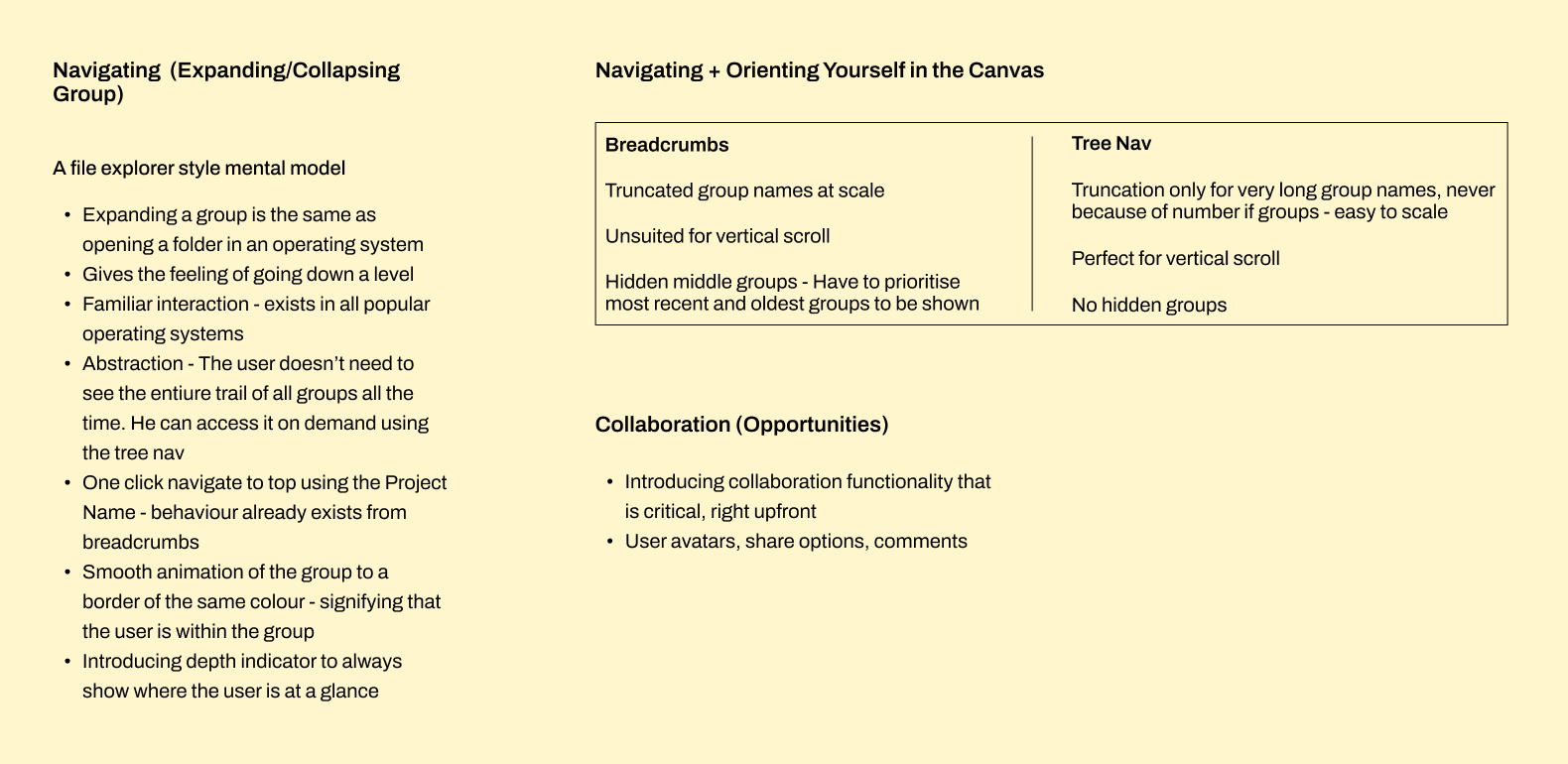
With the root problem identified, the next question was which representation of hierarchy would best match how users actually thought about their projects.
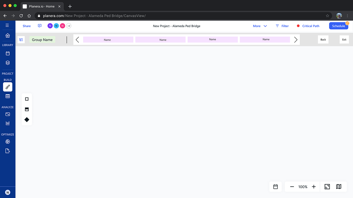
Rather than abandoning the existing model immediately, I explored multiple
ways to extend it. The explorations ranged from breadcrumb enhancements and
hierarchy indicators to navigable hierarchy structures.
Each iteration tested the same question: could orientation be improved
without fundamentally changing how users understood structure?
The answer increasingly pointed toward making hierarchy itself visible.
Key Insight
Users didn't need a better path. They needed a better map.
The explorations revealed something important. The limitation wasn't the breadcrumb implementation. It was the breadcrumb mental model.
Breadcrumbs help users understand a path. They explain how someone arrived at their current location. That works well when navigation is primarily linear.
Construction planning isn't linear. Projects contain phases, phases contain groups, and groups contain activities. Users weren't trying to retrace their steps. They were trying to understand how different parts of the project related to one another.
The challenge wasn't helping users move through a hierarchy. It was helping them understand the hierarchy itself.
Once the problem was framed that way, the solution became much clearer. The interface needed to make structure visible rather than infer it through navigation. A tree wasn't simply a different navigation pattern — it was a direct representation of how construction projects are actually organized.

Records where you've been. Works for linear paths. Loses meaning when structure is multi-level and non-linear.
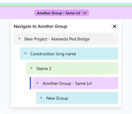
Makes the structure itself visible. Scales naturally with project complexity. Navigation becomes a side effect of hierarchy clarity.
With the mental model established, the next challenge was designing a system that held together across multiple product surfaces — each with its own role in how users understood and moved through the platform.
The Architecture
Navigation Was A System, Not A Screen
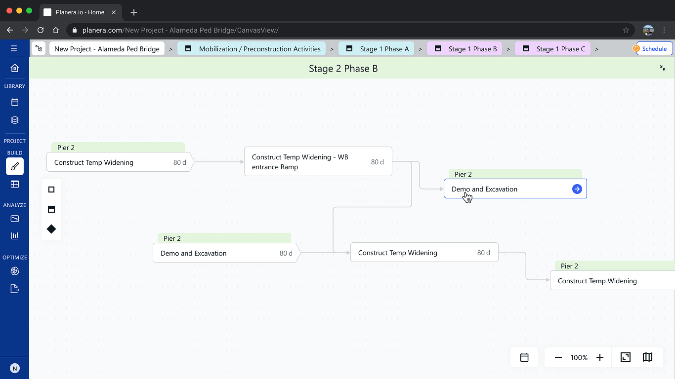
The redesign touched three interconnected surfaces: Groups, Canvas, and Header. Each contributed to how users understood structure, orientation, and collaboration. Rather than treating them independently, I redesigned them as parts of a single navigation system.
Surface 01 — Groups
Hierarchy containers · Spatial context
The primary surface for understanding project structure. Expanding a group reveals its children while preserving awareness of the surrounding hierarchy.
Surface 02 — Canvas
Navigation environment · Spatial continuity
The working environment where users plan and coordinate. Canvas provides the spatial continuity that makes moving between hierarchy levels feel coherent rather than disorienting.
Surface 03 — Header
Global orientation · Collaboration layer
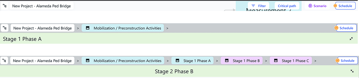
The persistent frame around the canvas. Redesigning navigation freed this surface from breadcrumb complexity — opening it to a collaboration layer the original design never anticipated.
Solution 01
Familiar Interactions Through Existing Mental Models
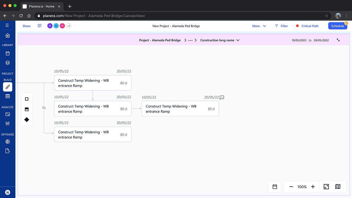
The tree model was established. The next challenge was interaction design. The inspiration came from operating system folder structures — a pattern users already understood. Opening a folder reveals its contents while preserving awareness of the surrounding hierarchy. No new mental model required. No retraining.
%201.png)
Entering a group visually encloses the canvas. A persistent depth indicator keeps hierarchy level always visible. Parent layers stay partially visible — preserving continuity as users navigate deeper into the project structure.
Solution 02
Transforming The Header Into A Collaboration Layer
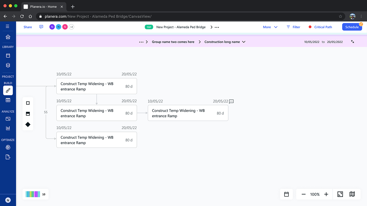
Solving navigation had an unexpected consequence. Simplifying the tree model reduced breadcrumb complexity in the header — freeing up space that unlocked an opportunity the original design never anticipated.
-
Navigation simplified
→Breadcrumb complexity reduced in the header
-
Space reclaimed
→Header could hold more than orientation
-
Collaboration layer added
→Sharing, presence, comments, platform actions
-
Platform layer established
→A navigation decision became a product capability
%202.png)
Many of these collaboration patterns were inspired by tools like Figma and adapted for construction planning workflows. What started as a navigation problem became an opportunity to improve how teams worked together.
Solution 03
Reinforcing Orientation Through Visual Language
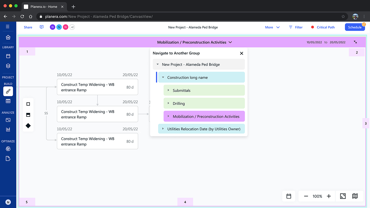
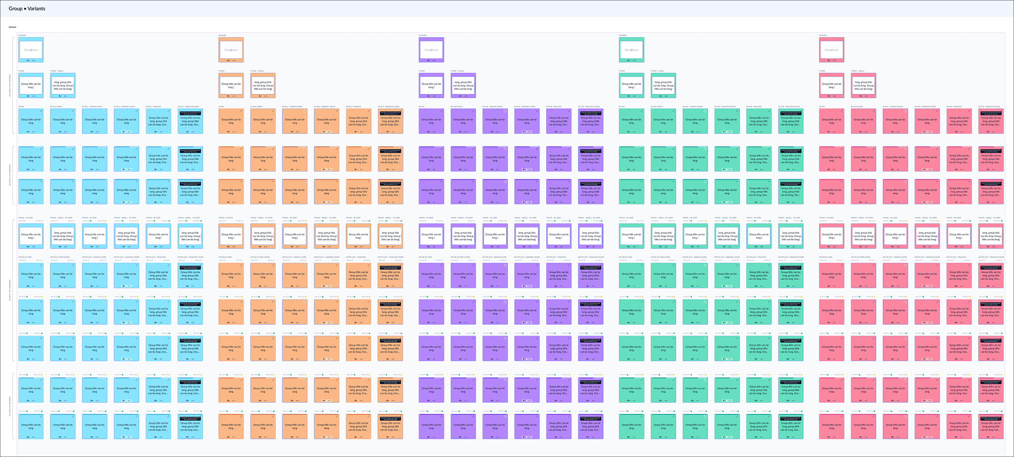
To strengthen hierarchy recognition, I introduced a scalable visual language using group icons and contextual hierarchy indicators. The icon system was designed to be reusable across every surface — turning a navigation decision into a platform-level design language.
%203.png)
The icon system extended naturally into every surface that needed to represent hierarchy — not just navigation. A single design decision that reached across the entire product.
Product Evolution
The system scaled without redesign.
Over the following three years, I continued leading design on Planera as the platform expanded into new planning and collaboration workflows. The navigation architecture and hierarchy language introduced during this redesign continued scaling with the product, requiring no fundamental redesign.
For me, that was the strongest validation of the work.
Not that we redesigned a screen.
But that we designed a system that continued evolving as the product evolved.
Outcomes
What the system delivered
- Improved orientation within deep project hierarchies — users navigated independently without prompting
- Enabled collaborative planning workflows through the redesigned header layer
- Established a scalable navigation architecture that held across multiple surfaces
- Created a platform-wide hierarchy language that extended naturally into new product layers
- Supported continued product expansion without requiring architectural redesign
- Cited by the client as the single most impactful change ever made to the product — nearly four years on
Company Growth
I continued leading design on Planera during a period of significant product growth, culminating in the company's $21.5M Series A raise led by Sierra Ventures and Sorenson Capital.
Reflection
Key Takeaway
Complex enterprise problems are rarely interface problems. They are usually coordination problems, information problems, or mental model problems that surface through the interface.
The most valuable lesson from this project was learning to understand the system behind the software before designing the software itself. Navigation wasn't a UI challenge — it was a question of how people understood structure, moved through complexity, and shared context with the people working alongside them.
Design that scales doesn't anticipate every future requirement. It establishes clear mental models — so when new complexity arrives, it has somewhere natural to live.