
Redesigning the Mobile
Banking Experience for
India's No.1 Bank

The Team & My Role
Led end-to-end design for the project, managing a multidisciplinary team and collaborating closely with cross-functional stakeholders across the organization
Internal
- Role
- Lead Designer
- Design Team
- 5 Product Designers
- Motion & Illustration
- On-demand specialists
- Project Manager
- Delivery & Coordination
Client
- Product Team
- Requirements & Prioritisation
- Engineering Team
- Feasibility & Implementation
- Experience Design Team
- Alignment & Collaboration
- C-Suite
- Workshops & Strategic Direction
The Challenge
Bridging the gap between digital capability and modern user expectations for 12 crore users
HDFC Bank has long been a digitally progressive institution, but its mobile experience had not kept pace with evolving user expectations and advancements in the ecosystem. Key journeys presented opportunities to reduce friction, improve accessibility, and create a more cohesive, modern experience.
-
Fragmented user base. We need to bring bank branch users and net-banking users to the mobile app. Only 50% of HDFC Bank users use the mobile app"
— Chief Digital Officer -
There's too much friction when it comes to making transactions. Core payment functionality like recurring payments and UPI are missing"
— Product Team representative -
Users are highly dependent on the Customer Support Team, overwhelming the support function. We need the app to be self sufficient, and more user friendly"
— Customer Support Team representative
Research & Discovery
Direct user access was limited, so we triangulated insights through stakeholder interviews, workshopping, and competitive benchmarking.
- Stakeholder interviews across customer support, product, engineering, and branch operations
- Workshops with leadership to align on vision and principles
- Strategic benchmarking (best-in-class products like Airbnb, Uber)
- Tactical benchmarking (banks, fintech apps, neo-banks)
Insights
Key product and experience gaps impacting adoption
-
Transaction Friction
High-frequency actions like payments were not optimised for speed or accessibility, increasing reliance on alternative apps for everyday banking.
-
Support Dependency
Users depended on customer support for basic tasks, indicating gaps in product clarity, self-service design, and in-app guidance.
-
Fragmented User Base
User segments were fragmented across channels — branch, NetBanking, mobile — limiting adoption of the app as a primary banking interface.
-
Onboarding & Access Friction
Onboarding and access flows introduced uncertainty and friction, causing drop-offs before users experienced any product value.
Constraints & Guardrails
Balancing usability with compliance, trust, and system realities
-
Regulatory Compliance
Key flows like onboarding, authentication, and data access had to meet strict regulatory requirements, limiting how much friction could be removed.
-
Security & Trust Sensitivity
Users were cautious about sharing personal and financial information, requiring clearer communication rather than reducing safeguards.
-
Existing Mental Models
Users relied on familiar banking patterns, making it important to align new interactions with established expectations.
-
System-Driven Dependencies
Backend processes such as customer data fetching and device binding constrained how certain flows could be simplified.
-
Diverse User Base
The experience needed to work across varying levels of digital literacy, requiring clarity, guidance, and reduced cognitive load.
Process Artefacts
Supporting research and exploration
-
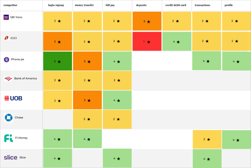
Competitive Benchmarking
-
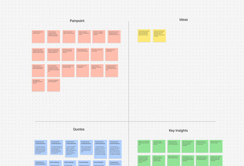
Discovery Workshops
-
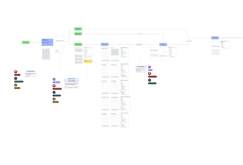
Information Architecture

Users
Designing for a diverse and fragmented user base
Through stakeholder interviews and internal research, we identified distinct user behaviors and needs across HDFC's customer base. These patterns helped us simplify complexity into clear user segments that directly informed key product decisions.
-
Digitally Active
Comfortable with fast payments and expect minimal friction
Enabled fast-access features like pre-login UPI and reduced interaction steps.
-
Low-Confidence / Assisted
Depend on support and need clarity in flows
Shaped guided onboarding, contextual help, and transparent permission flows.
-
Existing but Inactive
Already bank customers but not mobile users
Influenced multiple registration methods and inclusive access.
Strategy
Defining product bets and design principles to guide the experience
The research revealed systemic gaps across onboarding, access, and core journeys. We translated these into a set of product-level bets and guiding principles to improve activation, engagement, and long-term adoption.
Product Bets
-
Reduce friction at entry
Improve onboarding completion and activation
-
Enable self-sufficient usage
Reduce dependency on support
-
Unlock existing user base
Increase activation without new acquisition
-
Increase frequency of use
Drive engagement through faster access
-
Establish a scalable design foundation
Improve consistency and long-term usability
Design Principles
-
Deep Empathy
Design with a clear understanding of user context, constraints, and behavior — especially in high-stakes financial interactions.
-
Progressive Inclusivity
Create experiences that work across varying levels of digital familiarity, access, and confidence.
-
Positive Surprise
Introduce moments of delight within functional flows to make the experience feel engaging and human.
-
Evolve & Adapt
Continuously evolve patterns and interactions to meet changing user expectations and technological advancements.
-
Simplicity
Prioritize clarity and ease of use, reducing complexity in critical journeys to enable faster, more confident actions.
These principles and bets guided decision-making across the entire product.
Product Decisions
Shaping core journeys through key product decisions
-
Decision 01
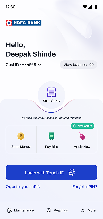
Transactions without login
We had to make a tradeoff between security perception and transaction speed. Existing solutions — biometric shortcuts and wallet-based access — still required an authentication step at the point of use. We moved to full transactions without login, making HDFC Bank the first bank in India to offer this. The decision directly addressed users' growing expectation for fast, frictionless payment access — shaped by increasingly seamless experiences across the payments ecosystem.
Business Intent
- Transactions per User (TPU)
- DAU / MAU Stickiness Ratio
- Time to First Transaction (TTFT)
Tradeoff
Convenience vs Security Perception
Maintaining auth was costing adoption without proportionally protecting trust.
-
Decision 02
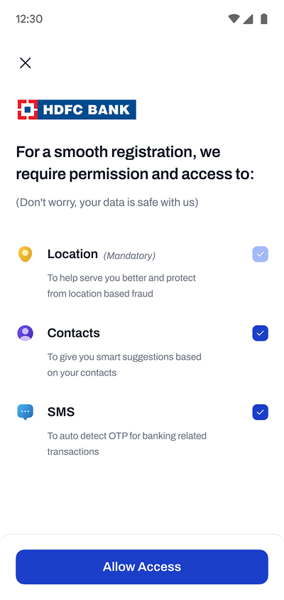
Thoughtful permissions
Permissions were system-driven interruptions with no context, causing hesitation in a high-trust environment like banking. Users felt a loss of control. We reframed permissions as transparent, user-driven decisions — balancing critical requirements with trust and choice.
Business Intent
- Permission Acceptance Rate
- Permission Step Drop-off Rate
- Feature Activation Rate (UPI, Contacts)
Tradeoff
Feature Activation vs Trust
Banking onboarding is the wrong moment for aggressive permission requests.
-
Decision 03
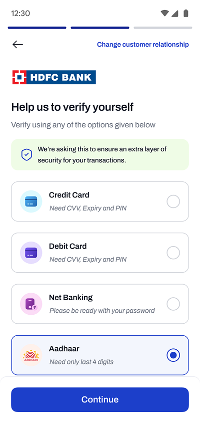
Multiple verification methods
Registration relied on fixed credential-based flows. When required information wasn't available, users dropped off and abandoned entirely. We introduced a flexible approach letting users choose their easiest path and recover from errors without exiting the flow.
Business Intent
- Registration Completion Rate
- Mid-Funnel Drop-off Rate
- Account Activation Rate
Tradeoff
System Complexity vs User Simplicity
Complexity absorbed by the system, not passed to the user.
-
Decision 04
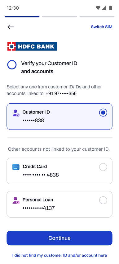
Inclusion of legacy users
A large portion of existing customers used NetBanking, credit cards, or branch services — with no seamless path into the app. We unified entry points so existing users could transition without additional friction.
Business Intent
- Activation Rate (Existing Customers)
- Customer Acquisition Cost (CAC)
- Products per User (Cross-sell Rate)
-
Decision 05
Adapting to different user needs
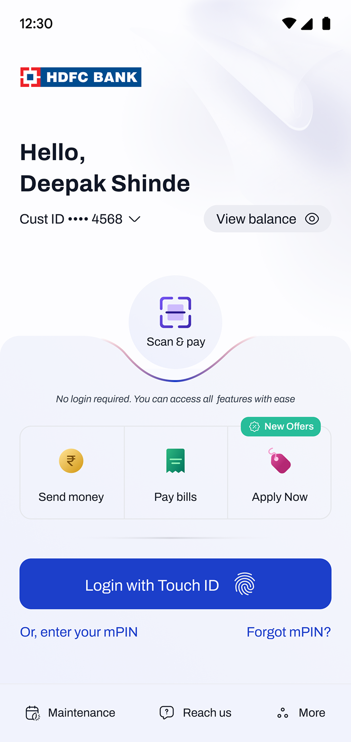
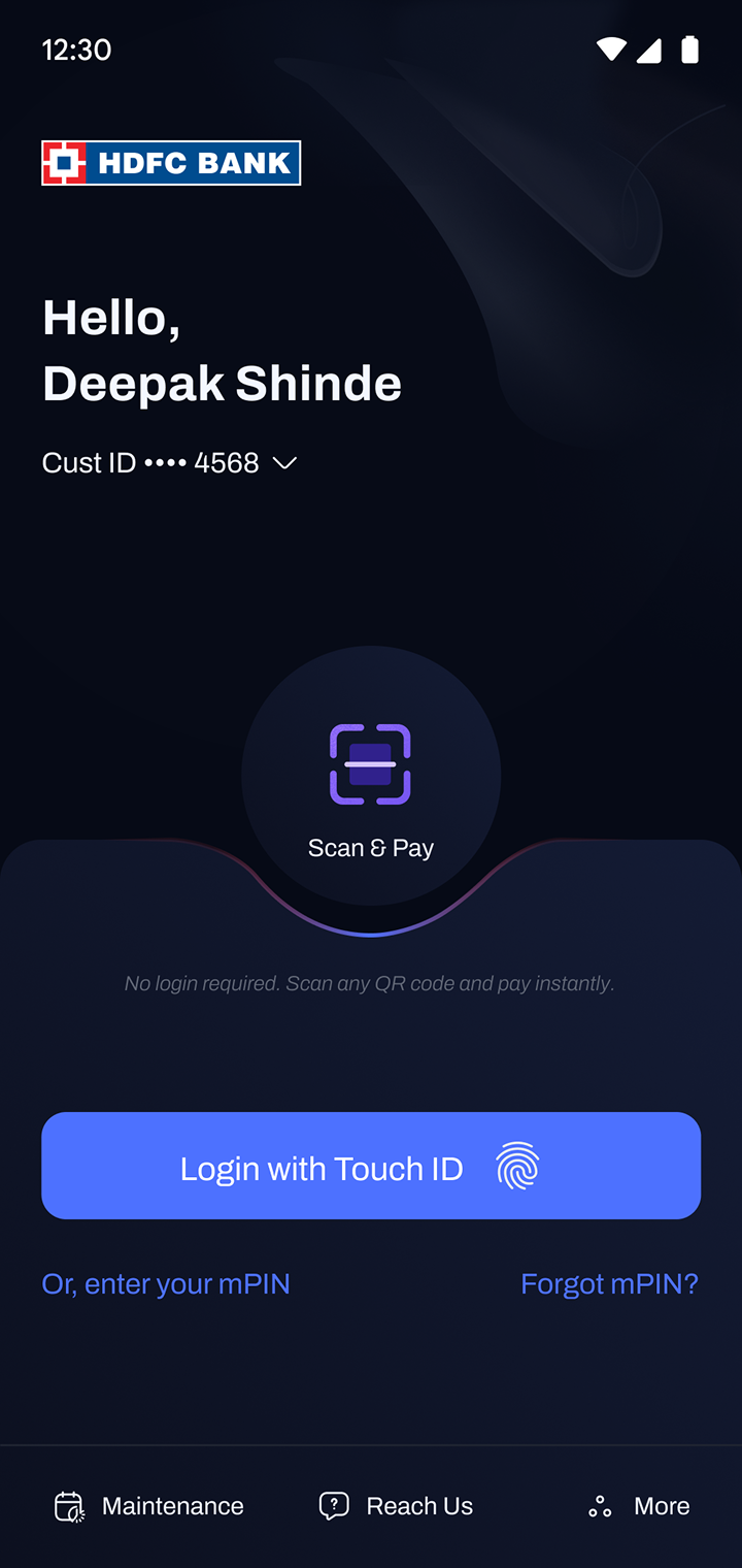
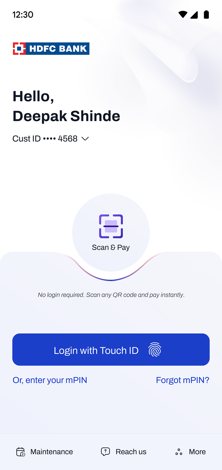
A single interface couldn't serve both confident and low-confidence users effectively. We introduced Simple and Power versions of the pre-login experience — letting users choose during registration with the flexibility to switch later. Same product, two levels of complexity.
Business Intent
- Feature Engagement Rate (Segment-wise)
- Sessions per User
- User Retention D/D
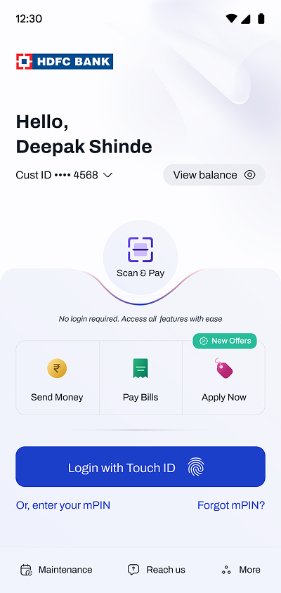
Pre-Login / Power 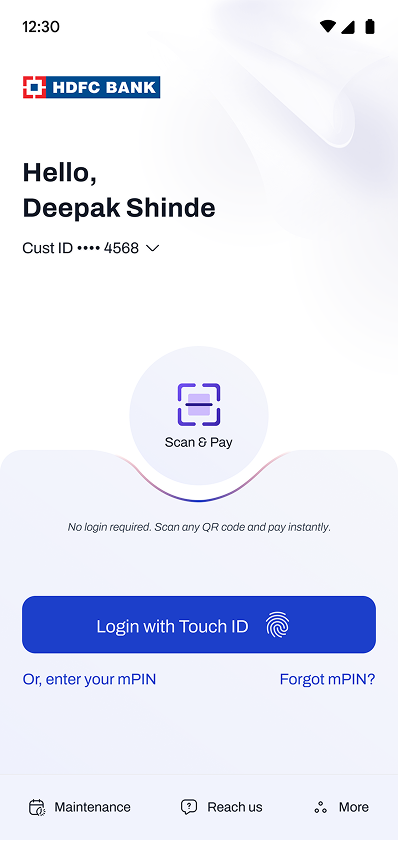
Pre-login / Simple

-
Decision 01
Key revenue drivers given highest priority
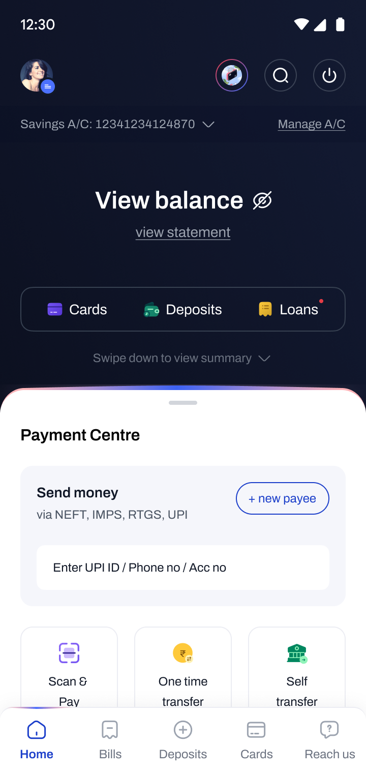
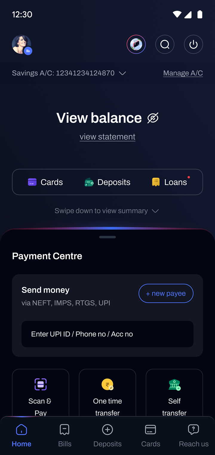
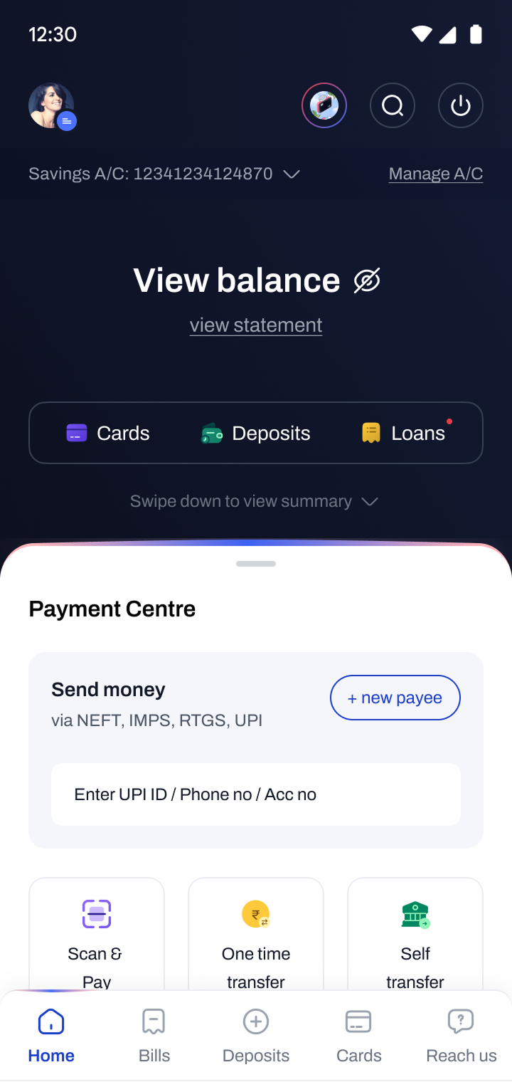
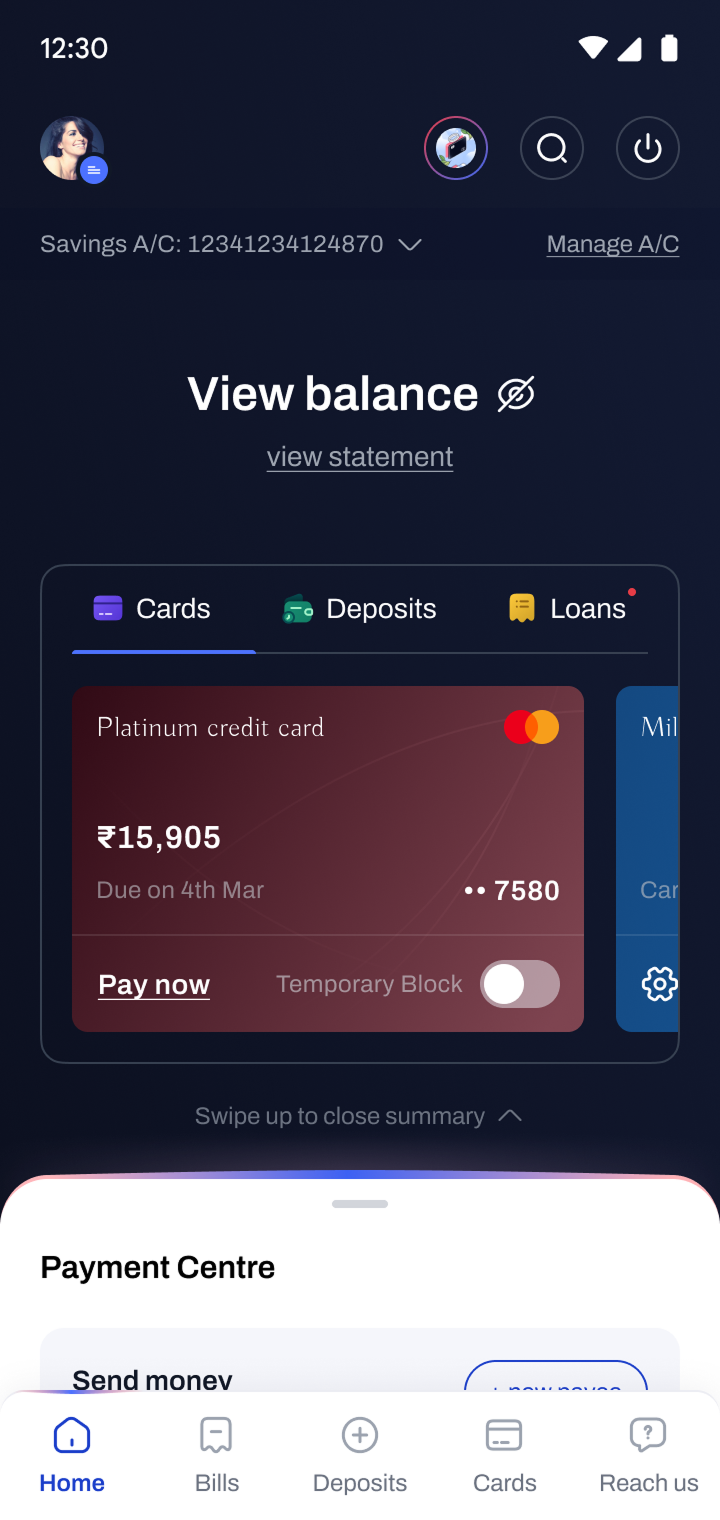
Cards, Deposits, and Loans are HDFC Bank's key revenue drivers. We gave them prime screen real estate with custom icons to draw attention. Deposits and cards are also accessible from the bottom navigation — never more than one tap away.
Business Intent
- Product Adoption Rate (Cards, Loans, Deposits)
- Conversion Rate
- Revenue per User (ARPU)
-
Decision 02
Unified payment component
Payments were scattered across multiple entry points, creating friction and confusion. We consolidated all payment actions into a single, consistent component — reducing cognitive load and improving discoverability of core transaction flows.
Business Intent
- Transaction Completion Rate
- Time to Complete Transaction
- Transactions per User (TPU)
-
Decision 03
Account balance hidden by default
A common concern was strangers glimpsing the balance when the app was open in public. Hiding it by default was a simple but powerful change — addressing a real user anxiety and enabling more confident, everyday usage.
Business Intent
- User Trust (Perceived Security)
- App Open Rate
- User Retention D/D
Tradeoff
Visibility vs Privacy
One extra tap costs less than the anxiety of exposed finances in public.
-
Decision 04
Inobtrusive ads and nudged offers
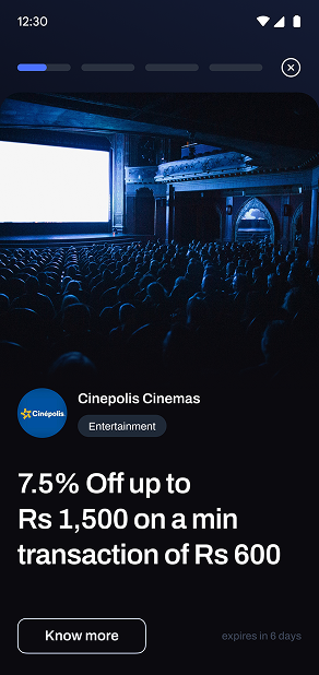
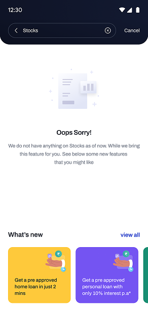
Users consistently complained about intrusive ads. We addressed this with a dedicated offers section styled like Instagram stories, accessible on demand, and strategic cross-sell nudges based on user preferences — replacing disruption with relevance.
Business Intent
- Offer Engagement Rate
- Offer Conversion Rate
- Ad Dismissal / Ignore Rate
Tradeoff
Commercial Goals vs User Experience
Trust across many sessions is worth more than conversion in a single one.
-
Decision 05
Personalized dashboards per user segment
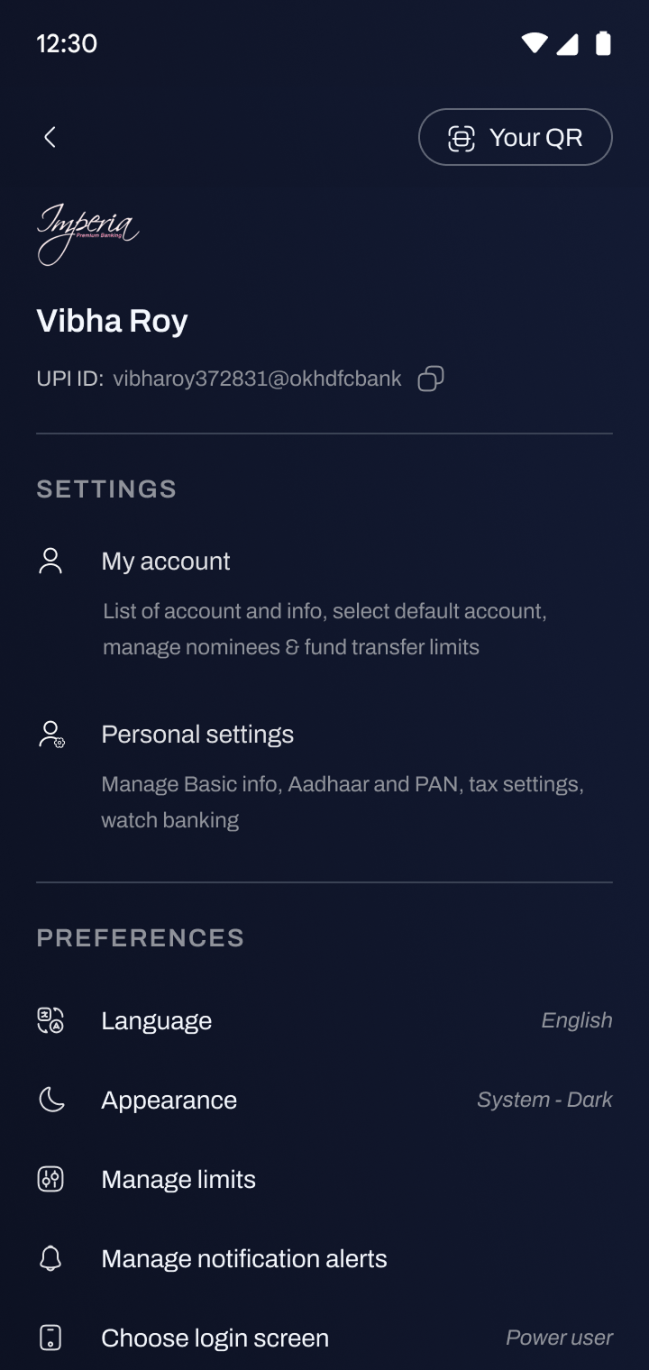
One dashboard couldn't serve all users effectively. We designed multiple versions — Standard, Standalone Credit Card, Standalone Loan, and Secondary Account — tailoring content and hierarchy to each profile without increasing overall complexity.
Business Intent
- Feature Engagement Rate (Segment-wise)
- Session Depth (Features per Session)
- User Retention (Segment-wise)
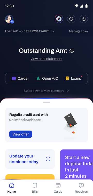
Standalone Loan 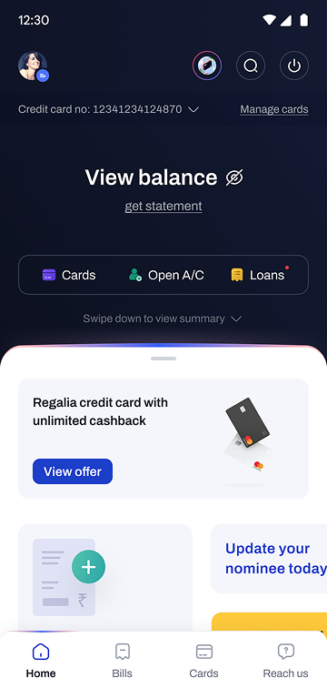
Standalone CC

-
Decision 01
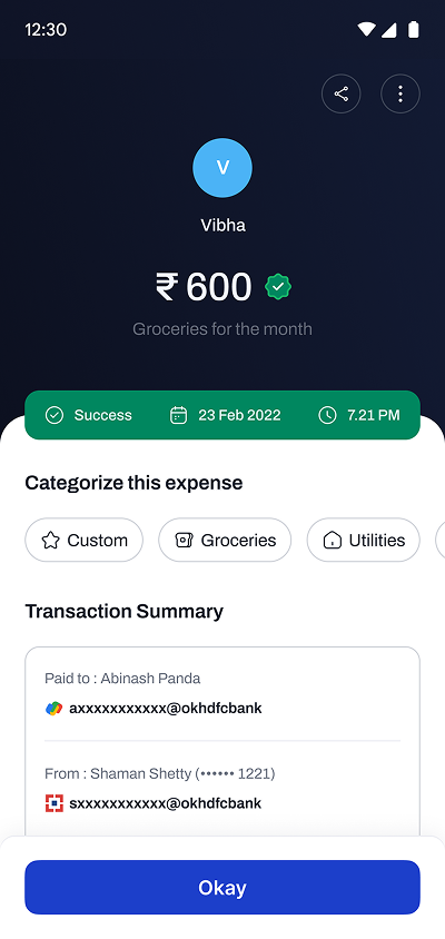
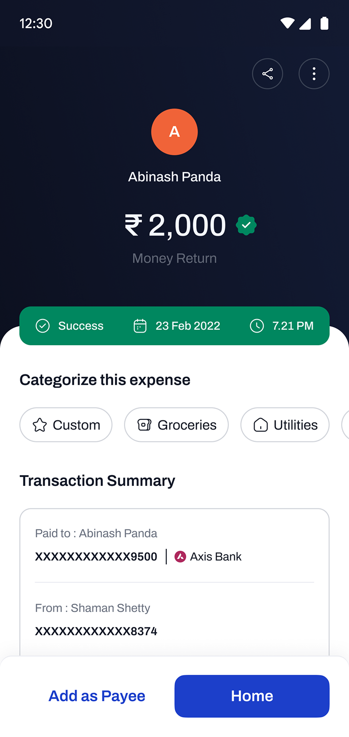
Overhauled transaction summary
The existing summary lacked hierarchy and was cluttered, making it hard to understand status or take follow-up action. We improved hierarchy, used colour to distinguish success, failure, and pending states, introduced transaction categories, and made sharing send a screenshot automatically.
Business Intent
- Transaction Review Engagement (Views / Time Spent)
- Follow-up Actions
- Transaction Support Queries
-
Decision 02
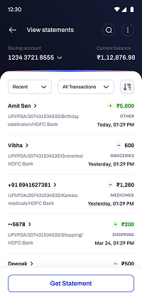
Powerful yet simple bank statement
The existing app had no way to download statements. We introduced downloadable statements with powerful filters and search — by user-created categories, by sent or received direction, and by transaction method (UPI, NEFT, RTGS) — letting users find what they needed without support.
Business Intent
- Statement Download Rate
- Search and Filter Usage Rate
- Support Queries (Statement-related)
-
Decision 03
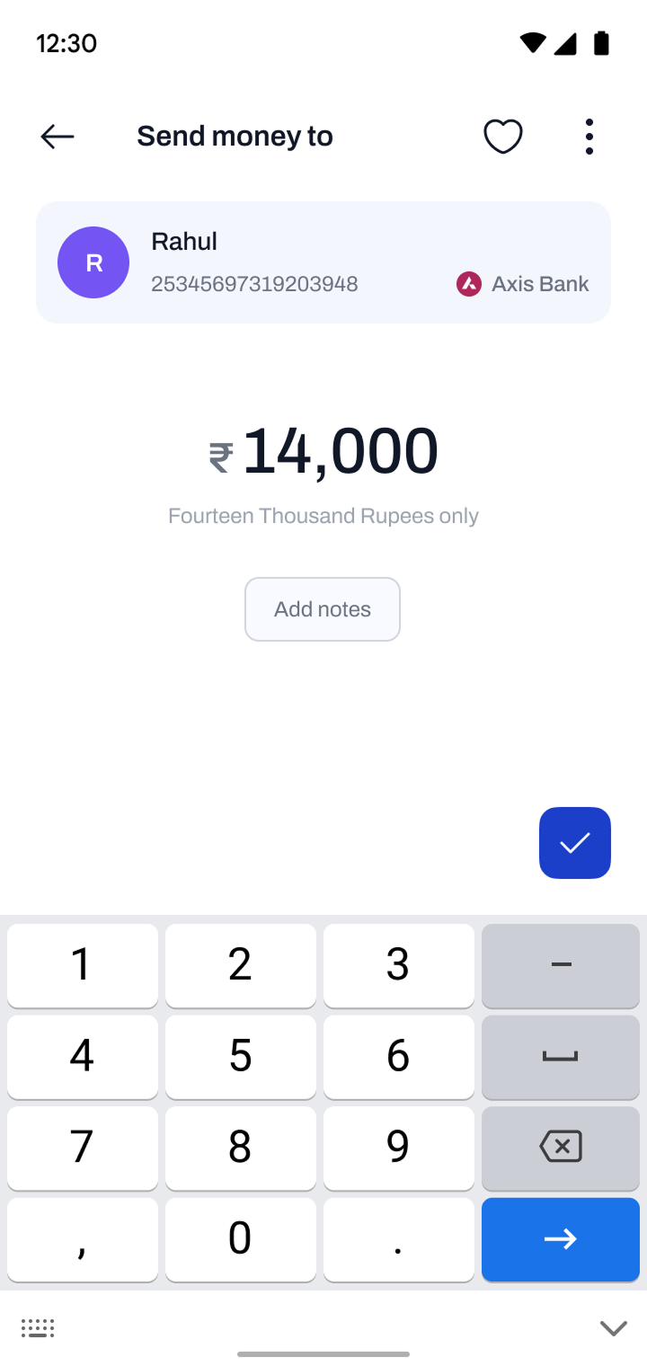
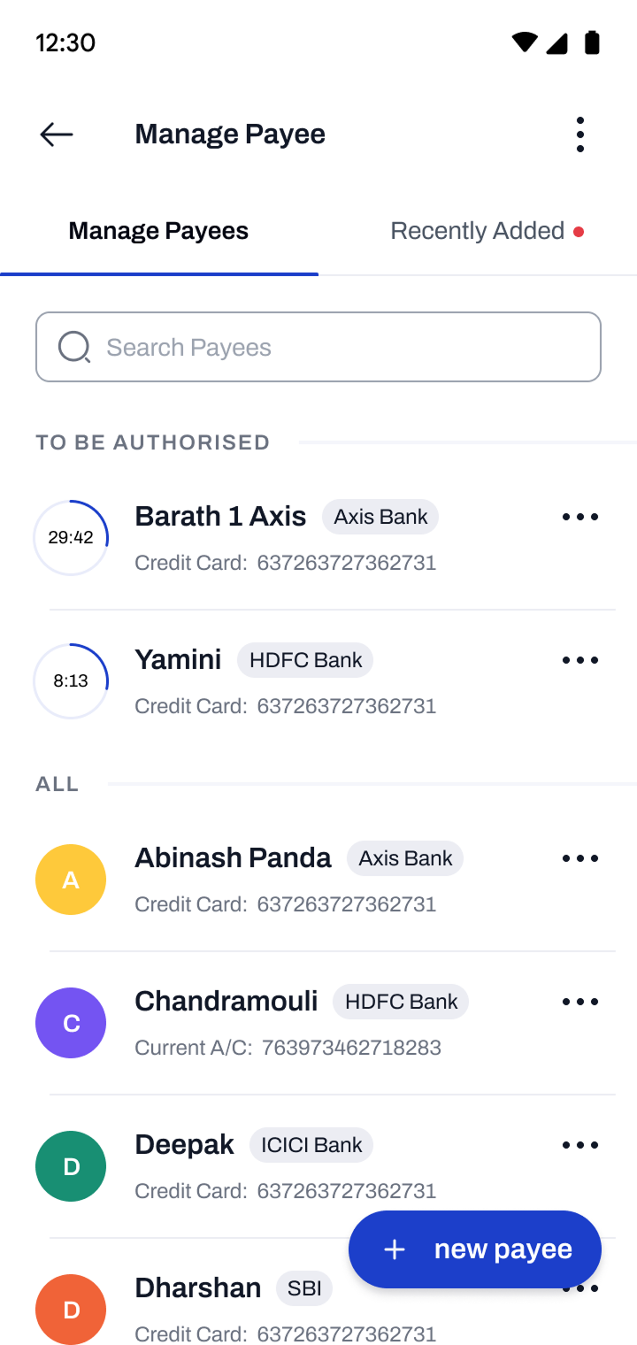
Reducing friction in beneficiary and payment entry
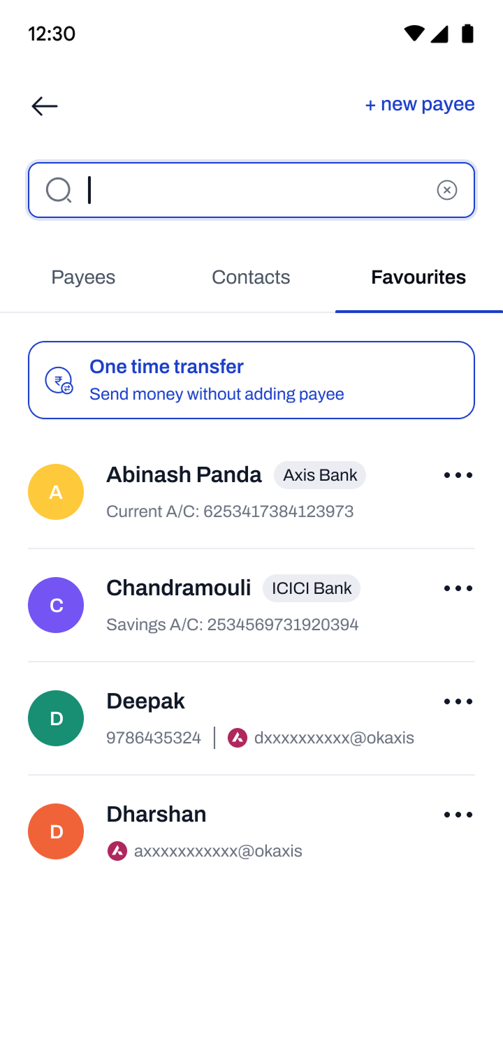
Manual entry of cheque or beneficiary details is error-prone and time-consuming — especially for high-value transfers. We introduced faster, more reliable input methods to reduce errors and build confidence at the point of commitment.
Business Intent
- Transaction Completion Rate
- Input Error Rate
- Time to Complete Transfer


Design System
Building a scalable foundation for consistency and speed
We built an atomic design system from the ground up — covering tokens, components, and interaction states — to ensure every screen felt cohesive and could be built faster across the team.
-
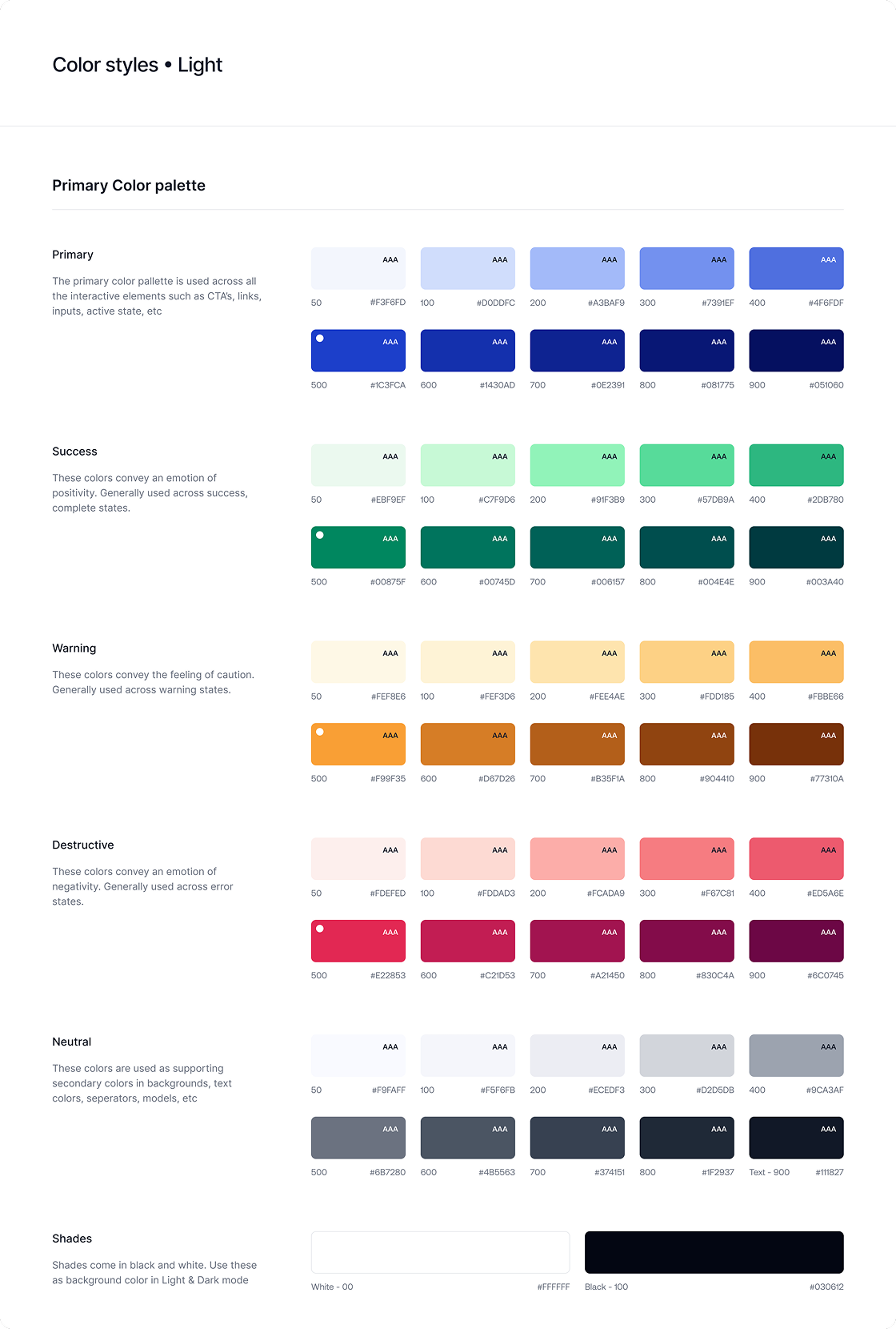
Atom / Colours — Light
-
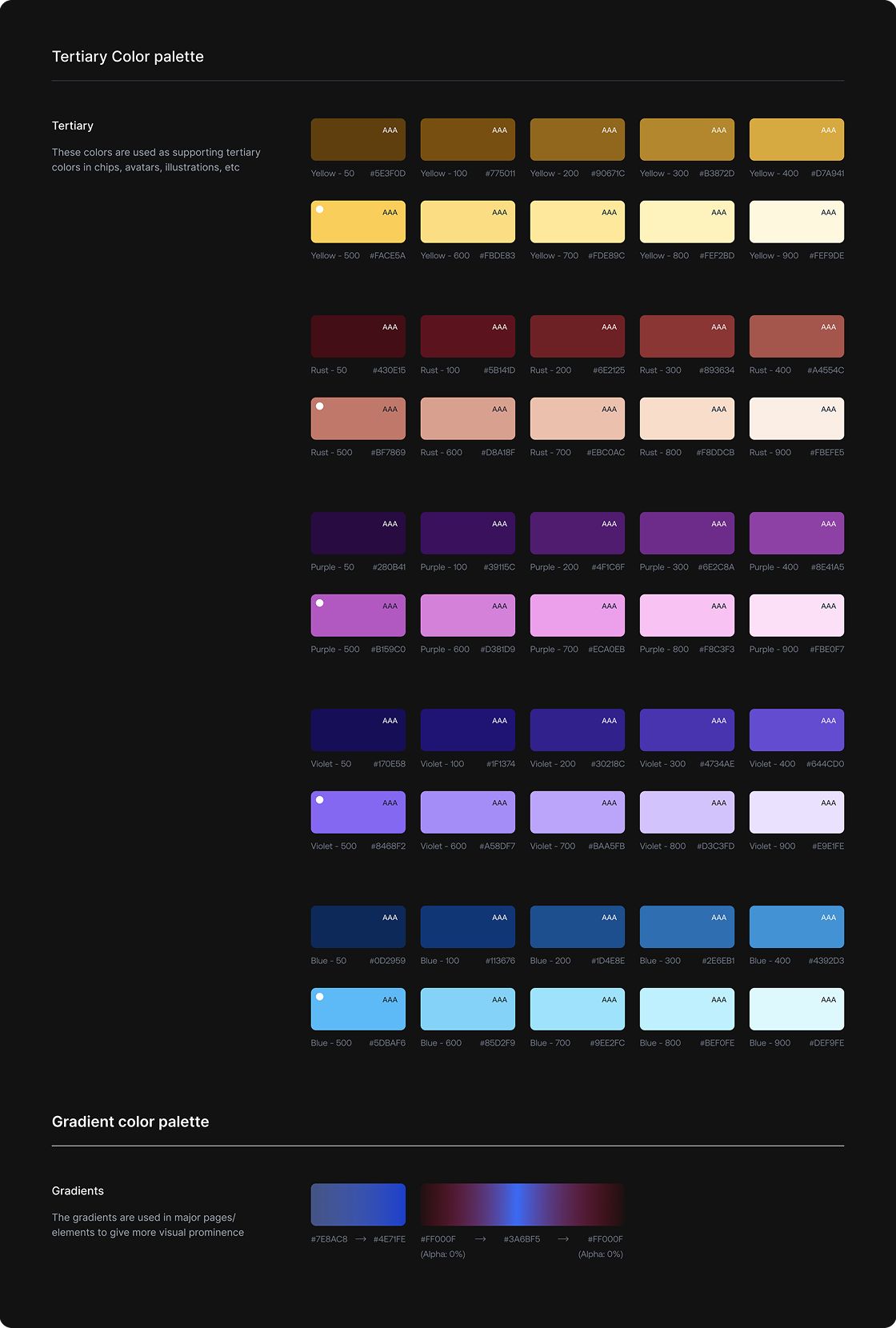
Atom / Colours — Dark

-
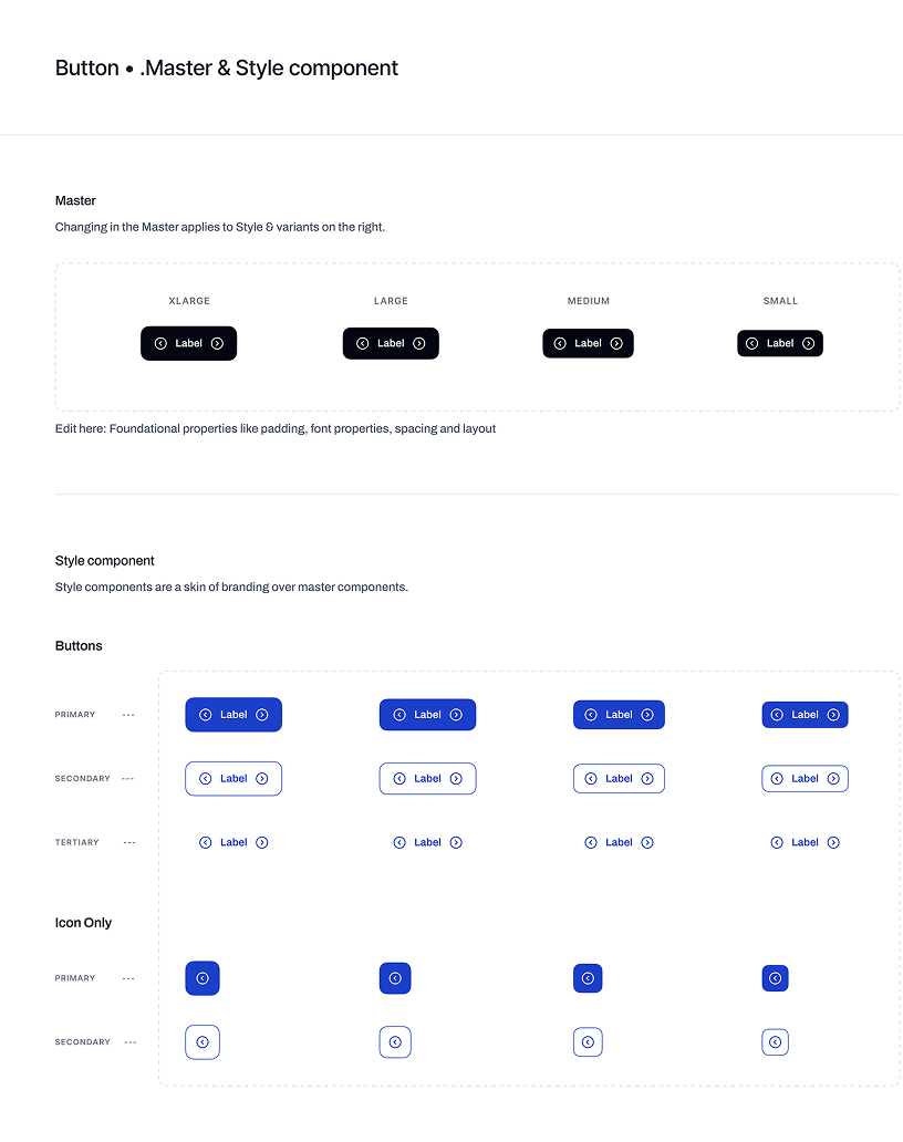
Molecule / Button — Master Component
-
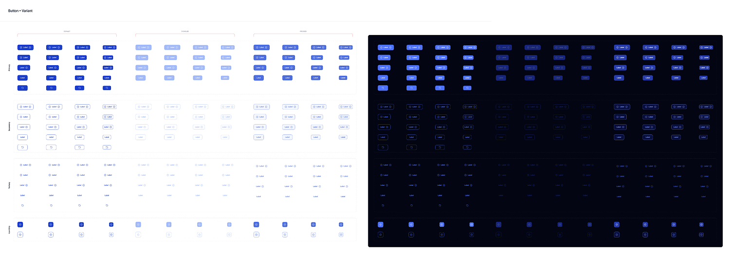
Molecule / Button — Variants
-
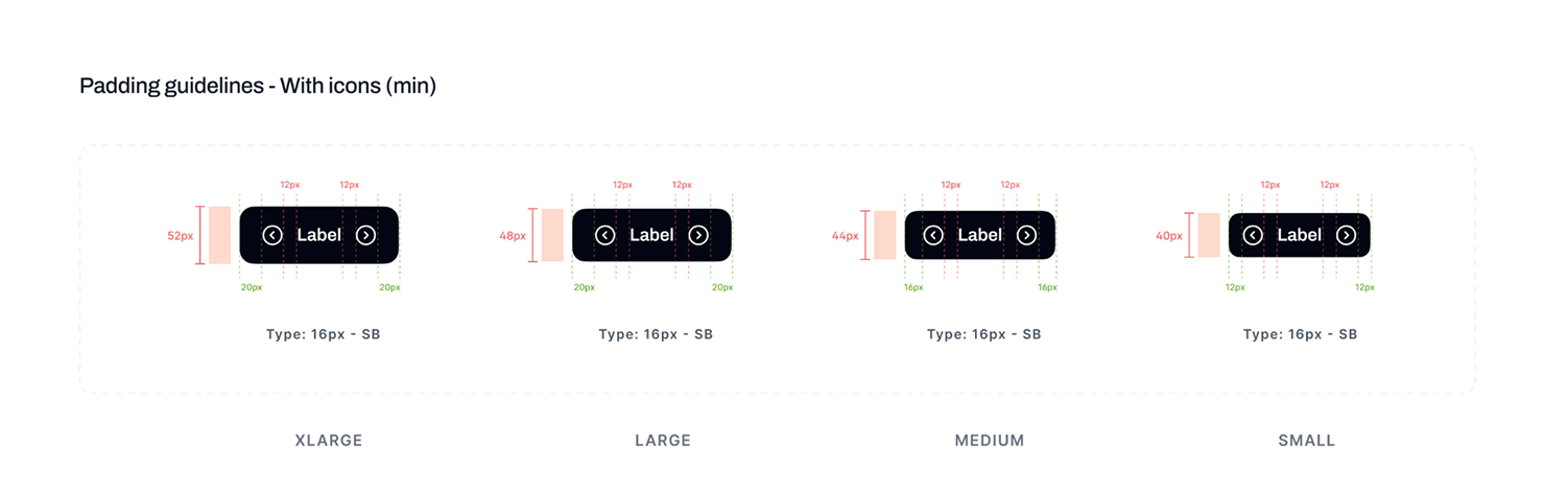
Molecule / Button — Redlines
-
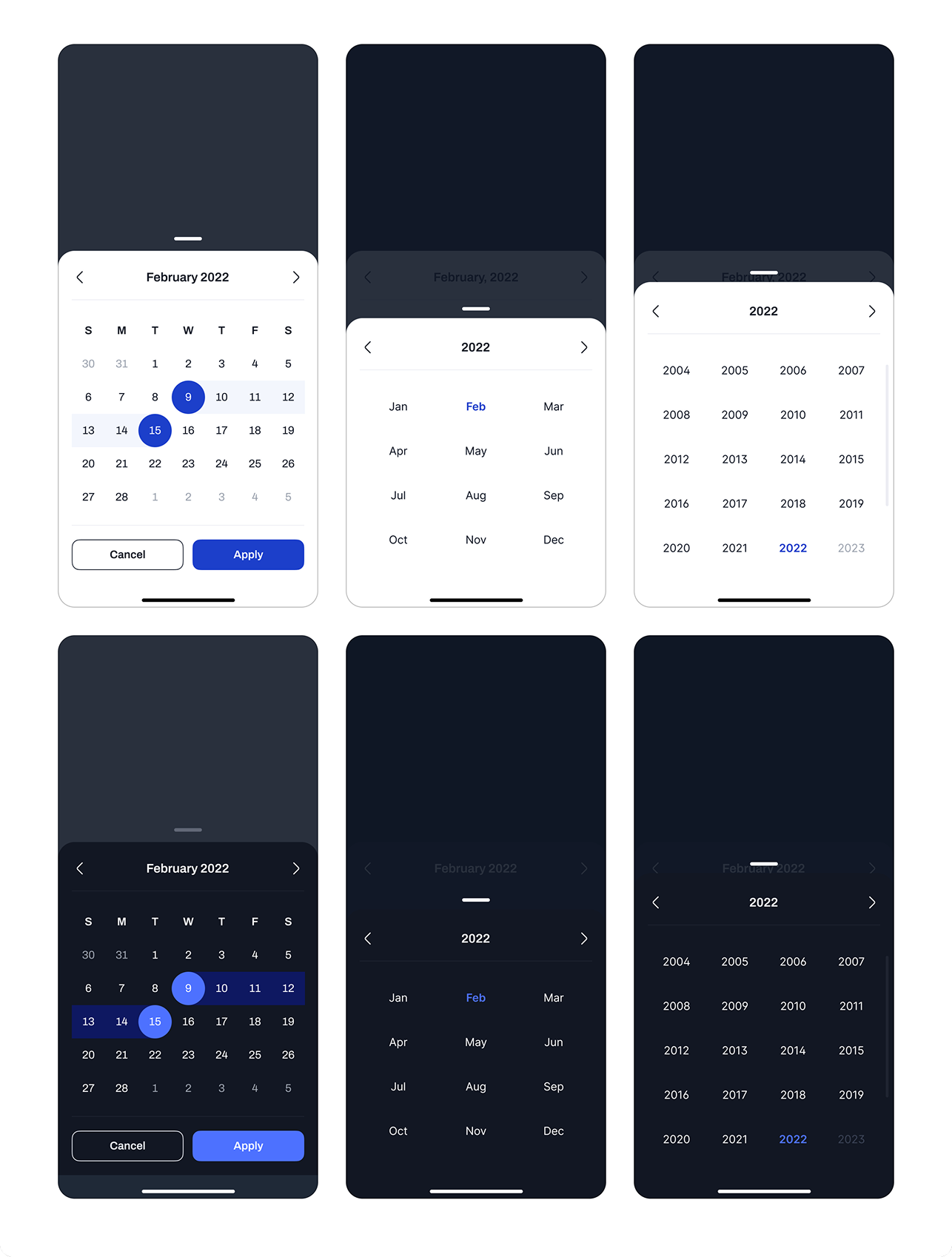
Organism / Date Picker
-
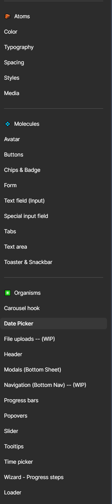
List of Components
The system reduced design time by 50% and is now in use across multiple HDFC Bank products beyond the mobile app.
Testing & Validation
Validating usability across real-world scenarios
Findings & Design Implications
-
Onboarding terminology confused users
System-driven labels in early registration steps caused hesitation and errors.
Language rewritten in plain terms before launch
-
Users gravitated toward lower-friction auth
Strong preference for OTP over more secure but slower verification methods.
Validated the case for pre-login transactions
-
Money transfer entry points were unclear
Users could complete transfers but struggled to find the starting point.
Entry point surfaced more prominently in the dashboard hierarchy
-
Decision-heavy flows caused hesitation
Too many options with unclear labels slowed low-confidence users significantly.
Option count reduced; labels rewritten before launch
-
Statement flows performed strongly
High task success — the design aligned well with user expectations.
Design retained with no major changes
Impact
Driving activation, transaction success, and feature adoption across core journeys
The redesign focused on improving usability across onboarding, transactions, and account management—directly influencing activation, task completion, and adoption of key financial actions. By addressing gaps in clarity, trust, and discoverability, the experience was made more intuitive, scalable, and aligned with user behaviour.
Quantitative Outcomes
-
100%
Successful navigation of the onboarding flow after simplifying key steps — demonstrating low friction in a previously high-drop-off activation journey.
-
~97%
Completion rate on money transfer tasks, validating the unified payment component and improved discoverability of core transaction flows.
-
~82%
Statement task success without assistance — significant given the previous app had no statement feature at all. Users were previously calling support for this.
Qualitative Outcomes
-
Users completed key journeys independently
Real reduction in support dependency — users who previously needed assistance were completing banking tasks on their own.
-
Improved discoverability of critical features
Clearer entry points and better information hierarchy increased visibility of transactions, statements, and filters.
-
Reduced cognitive load across journeys
Eliminating redundant steps and unclear labels improved user confidence and reduced hesitation in onboarding, payments, and account management.
-
Deeper product insights beyond UI
Testing surfaced insights around trust, security perception, and transaction behaviour that shaped broader product thinking beyond the redesign itself.
Social Proof
External validation from users, industry peers, and market adoption
The redesigned experience was not only validated through usability testing but also received strong positive signals from users and industry professionals. Feedback highlighted improvements in clarity, usability, and overall product direction—reinforcing the impact of the design decisions at scale.

Final Designs
Validated design solutions ready for scale
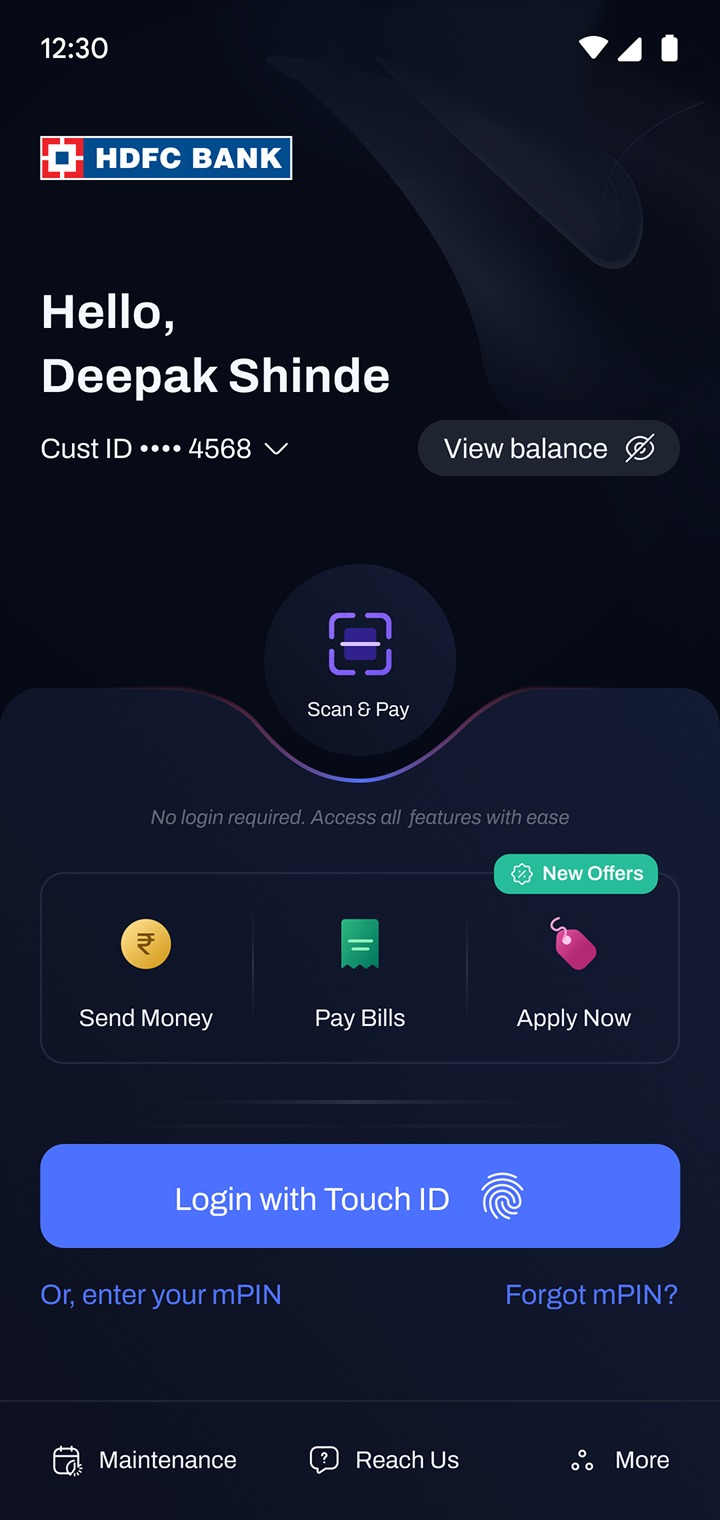
Dashboard Prototype
Registration Prototype